Review: Typography for Lawyers
Jason Wilson was kind enough to send me a review copy of Matthew Butterick's "Typography for Lawyers." Butterick - who runs a website also named Typography for Lawyers - has a visual-arts degree from Harvard and worked as a font designer and later a web-designer. He's now a lawyer who practices civil litigation in Los Angeles. His experience qualifies him to write this book. 
TFL is full of helpful tips, ranging from the selection of appropriate fonts to spacing, sizing, the use of small caps (etc.). What makes the book incredibly useful is that Butterick:
The book is not just useful for lawyers, but for drafters of all kinds of documents. It would make the perfect gift for the legal professional in your life. You can't go wrong if you are buying it for yourself. I highly recommend it. You can buy it at the Jones McClure website here or at Amazon here. At $25.00, it's a steal.
Other reviews: Scott Greenfield; Molly DiBianca; Ernie Svenson; Mark Bennett.
Added: Legal Geekery interviews Butterick in a podcast here: "Episode 21: Typography for Lawyers, CES, Searching Cell Phones, and More."
Related - The two space controversy: Farhad Manjoo in Slate pens a polemic on using two spaces after a period: "Why you should never, ever use two spaces after a period." Butterick of course has weighed in on this topic. Here is his take:
TFL is full of helpful tips, ranging from the selection of appropriate fonts to spacing, sizing, the use of small caps (etc.). What makes the book incredibly useful is that Butterick:
- explains his rules and suggestions;
- talks about rules which are now outdated and why they developed the way they did; and
- includes technical tips on how to implement his rules in various word processing programs.
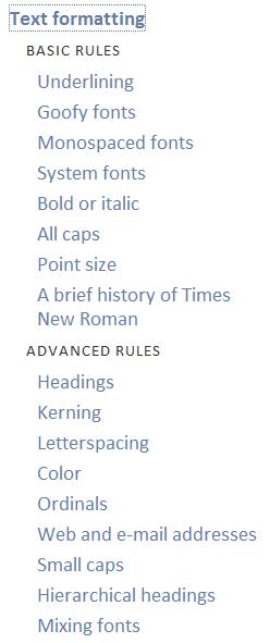
You could literally open the book to any page, read for five minutes, and come away with some helpful information about typography and how it affects a document. You can then easily implement his rules and suggestions. The short book (216 pages, including the foreword and acknowledgments) covers just about every aspect of typography, and its thoroughness will seem daunting, even to those who are tuned in to typography and formatting. For example, here are the rules for text formatting that he covers:
Reading the book will cause most people to examine their basic formatting and typography practices that they have taken for granted their entire writing lives, and this is a very useful exercise. (Personally, I have focused much more on formatting than typography in the past. It will certainly take some time to implement the helpful suggestions from the book. Of course, typography is not something I pay much attention to when blogging, so don't bust my chops over poor typography practices when I write online.)
Other reviews: Scott Greenfield; Molly DiBianca; Ernie Svenson; Mark Bennett.
Added: Legal Geekery interviews Butterick in a podcast here: "Episode 21: Typography for Lawyers, CES, Searching Cell Phones, and More."
Related - The two space controversy: Farhad Manjoo in Slate pens a polemic on using two spaces after a period: "Why you should never, ever use two spaces after a period." Butterick of course has weighed in on this topic. Here is his take:
Some topics in this book will involve discretionary choices. Not this one.There you have it!
Always put exactly one space between sentences.
Or more generally: put exactly one space after any punctuation.


Comments